5 office design essentials for a purposeful commercial office interior
Here are 5 office design essentials for a commercial office space. Get inspiration from our experts for a...
Peldon Rose Senior Project Designer Colm Murphy discusses design trends that are long-lasting and future-proof.


When looking at the biggest design trends to come out of 2022, we dismissed anything that we believe to be a ‘trend’ and focused on aspects that we see as design considerations that will stand the test of time. We don’t believe in following every trend; we believe in designing sustainably for the long term, not requiring constant updating.
One central theme that is consistent across the board is people-centric design. Now more than ever, businesses need to be putting human needs at forefront of workplace design and create diverse environments that go above and beyond the basic requirements of the traditional office space.
The next generation of talent is always looking to learn in every environment they are in, and the workplace is no exception. Having spaces where training can take place, as well as providing opportunities throughout the space for mentorship, is key. Alternative asset managers, Preqin, have a space on their lower ground floor specially designed so that training sessions can be held consistently throughout the year. By having this space set away from the main hub of the office and with its own breakout facilities, distractions are limited and an environment for leaning is encouraged.
Grant Thornton, whose employees regularly study and sit their accounting exams, have dedicated exam rooms and study areas that have been designed so that those individuals are shielded from the buzz of the central hub to focus on their qualifications. It is elements such as these that can help to bolster talent attraction – and retention - and act as an attractive offering for the future generations.

With greater emphasis being put on providing a neurodiversity-friendly environment, we are more aware of the workspaces that we are in and how these impact our everyday activities including our working styles. With 17% of the population diagnosed with neurodiversity, including ASD, ADHD and Dyslexia, we need to create diverse workspaces that bolster inclusivity and cater to all.
For MS Society, it was about using flexible and accessible spaces. Everything down to the floorplate layout and colour and tones selected were considered in order to create the perfect environment for the charity to work in. Elements such as the wayfinding and graphics have been selected to ensure they are easily understood by all.


In a similar way, we used colour as a wayfinding solution to distinguish areas around a space we refurbished for another client. With a broad spectrum of requirements across teams, as well as individual specific requirements, we wanted to create an intuitive space that will provide a place for everyone. Warmer vibrant colours denote collaboration zones and more muted tones are used in the focus and wellness zones of the office, creating the right mood for people’s required level of stimulation, as well as the activity.
In what initially was believed to be a fleeting trend, the ring light has now become an office staple with video calls now a normal part of everyday working. With its origination in film and photography, it’s the optimum way of illuminating faces for clarity and engagement, and various offices are now using them for their daily meetings. This year we were challenged by creative agency, Brandpie, to install a ring lighting into their meeting pods. Working with several suppliers, we were able to design a custom-made ring light that was then installed– truly reflecting the needs of their employees and clients.
It would not be right to call sustainability a trend as it’s at the forefront of all business's agenda, but it has to be included as an ever more important design consideration – we stress, not a trend. However, when it comes to workplace design, our in-house design team are continually challenging their own approach to sustainability to ensure that it is reflected in spaces they create.
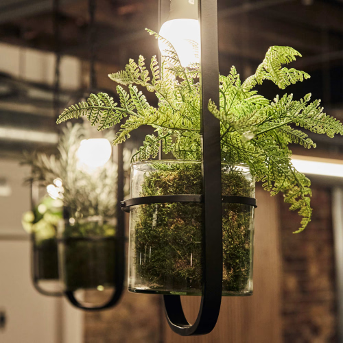
One project that really made us sit up and listen was the creation of a new home, The Joinery, a converted warehouse for environmental activist ClientEarth. The project took on a rustic feel with natural materials being used alongside biophilic design to showcase the very best that nature has to offer. From low VOC level paint to A+ rated environmentally efficient flooring that meets the green seal standards, every element of this workspace has been carefully thought through.


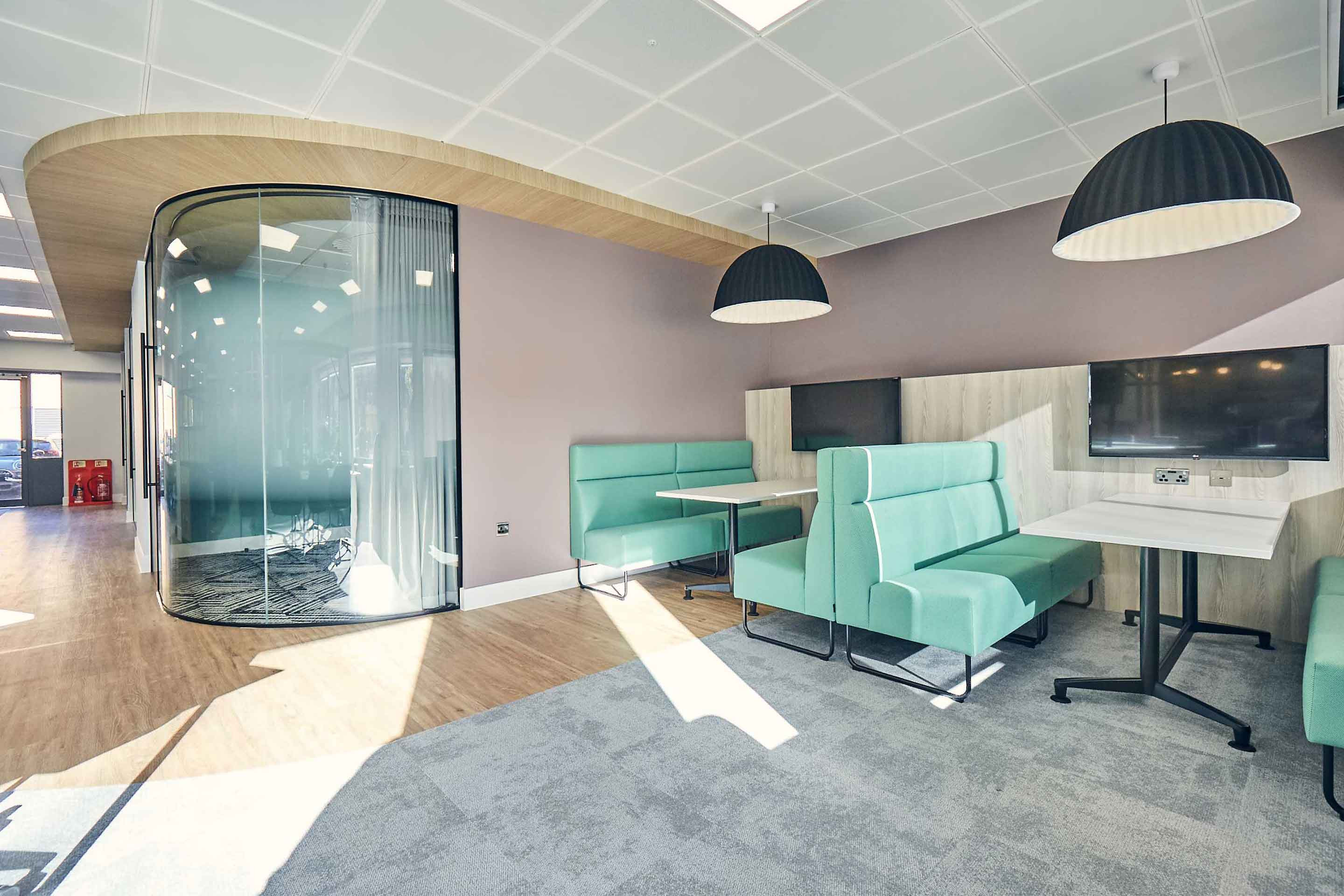
Having had our home comforts at our fingertips, the workplace now needs to ensure that they are mimicking this in the workplace. Now, we’re not encouraging days spent in athleisure wear, but instead adapting workplaces so that they offer more than just a desk to work from. By incorporating coffee shop style breakout spaces, with healthy food to quiet library spaces that promote concentration, employees can adapt depending on their working style and mood. It is not unheard of for us to design in house coffee shops that have their own baristas!
By designing spaces that are all about people and providing optimum comfort and flexibility, businesses are creating destinations that their people will chose to work from, no matter the reason. After all, people will always be the constant in the ever-changing landscape of the workplace.

Here are 5 office design essentials for a commercial office space. Get inspiration from our experts for a...

Designing a small office setup can be a challenging task. We've compiled seven small office design ideas to...

Here are some creative office lighting ideas from Project Designer Ashton Holmes to brighten up your office.

Whatever stage you’re at in your office fit-out process, there are hazards and risks that you must prevent...

Your workplace holds enormous potential to improve your business performance. Get in touch today, and we will unlock that potential together.