5 office design trends for 2025
Explore the top 5 office design trends for 2025 and learn how to create purposeful, future-ready workspaces...


Article by Natasha Hewlett
According to YouGov, blue is the most popular colour on earth. Throughout history, the colour blue has been applied to symbolise feelings of prosperity and hope. For example, blue was chosen as the colour for the flag of the United Nations when it was founded in 1945 as it was believed to represent harmony. However, different shades, tones and hues of blue can be associated with a plethora of emotions, varying from serenity, to intensity and even sadness.
One of three primary colours, blue is combined with red and yellow to form an entire colour gamut, from where the design process can begin. As Kandinsky famously said, “colour is a power that directly influences the soul” and in design, colour has the power to directly influence the way we behave or interact within a space.
Every colour evokes a mood or feeling, and the psychology of colour manipulates the entire atmosphere of a space whether the intention is to stimulate creativity, productivity or create a calming atmosphere. Our perceptions of blue can vary, depending on the shade that is applied. Light blues such as powder blue are calming, bright azure blues are energizing, and dark blues like inchyra reflect strength and reliability.
Within the workplace, using tones of blue creates a sense of tranquillity, calmness and stability and research has even shown that humans are most productive in a blue room or environment.
Imagine catching a ride on a rocket and taking a trip into space. Once you’re far beyond the atmosphere of planet Earth and engulfed by the stars, you may take a look down below, where the colour you’ll notice is blue. Around 70 percent of the Earth’s surface is covered in water, which appears blue as the white light that shines from the sun contains blue wavelengths that are less easily absorbed by water than wavelengths of another colour. That’s why the sky looks blue too. As humans, we have an innate affiliation to nature and spending time alongside the ocean or beneath a bright sky is linked to improved health and wellbeing. This may explain why the colour blue creates a mental reaction that destresses and soothes, as it connects us to nature.
For 2021, I believe Classic Blue is one to watch. It’s timeless and elegant and can offer a feeling of reassurance and stability that many of us are looking to reinstate into our lives.
As an alternative, a fresher shade of blue such as a teal could be a popular choice for those wanting to rejuvenate a space, or to symbolise new beginnings. This type of blue may appear a little cold, so I’d suggest adding warmth with elements of bronze and pops of rose pink.
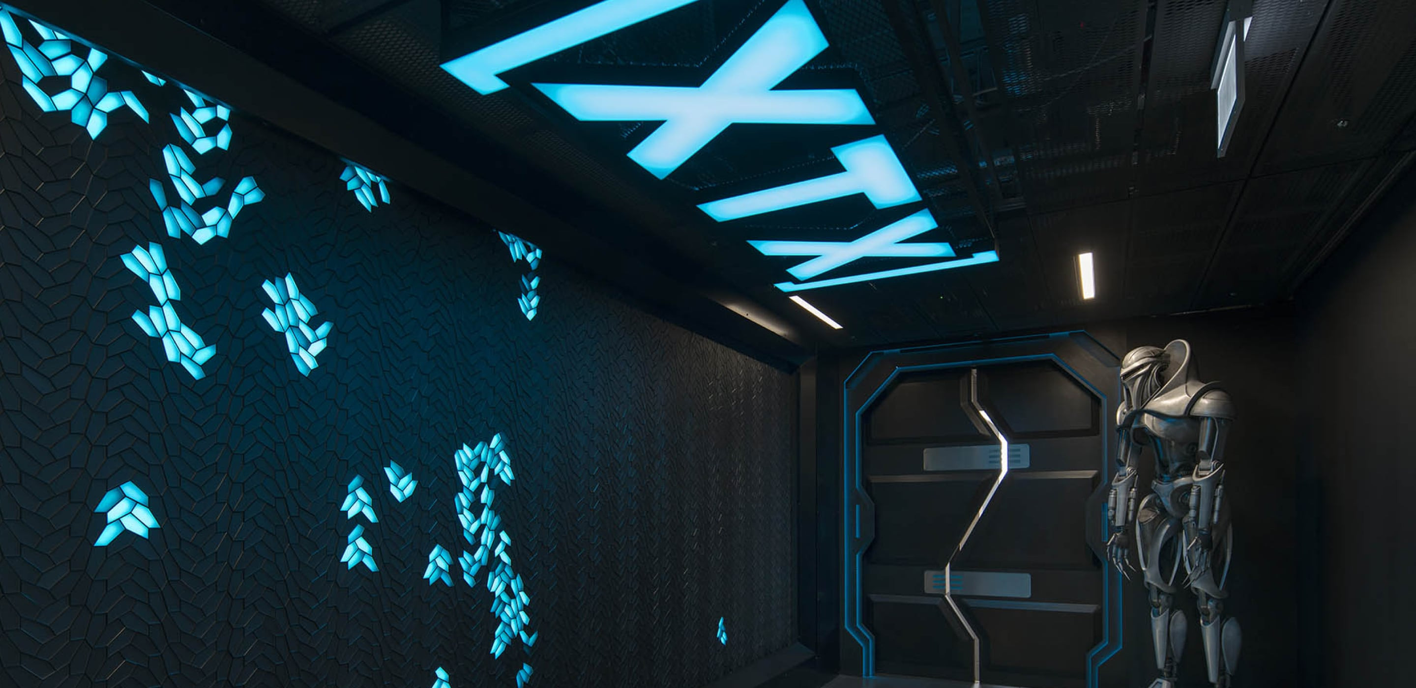
Crucially, it’s important to choose a shade of blue that reflects your own personality and style. For example, upon arrival at Peldon Rose’s home, Sterling House, swathes of Aegean blue enfold the hub of activity that takes place across the ground floor, at the heartbeat of Peldon Rose. This creates a warm and welcoming atmosphere for those who visit, with a vibrancy that reflects the values and attitudes of our people.
Adding colour to a space can often seem daunting. If you’re apprehensive about splashing colour across an entire feature wall, start small. Take a look at the space around you and consider the colours that already exist, even down to the colour coming in from the window at different points throughout the day.
To begin, incorporate bolder colours into dressing items. Throws, cushions and strong artwork have the power to shift the dynamics of a space. Using moveable accessories offers you the flexibility to continually re-work the space until you find a blend of colour that creates your desired effect. You can change the mood of a space simply and easily, the biggest challenge is having the confidence to do so. Be bold, and experiment with blue.

Explore the top 5 office design trends for 2025 and learn how to create purposeful, future-ready workspaces...

Cat A, Cat B and Cat C office fit outs are tailored to your business’s needs and goals. Find out which one...

Learn strategies for creating an inclusive workplace in our guide to inclusive office design

Workplace Consultant, Sameeha Joshi, explores the importance of supporting wellbeing in the workplace...

Your workplace holds enormous potential to improve your business performance. Get in touch today, and we will unlock that potential together.