The power of colour: 10 colour ideas to enhance your office
In this article, we'll explore the power of colour and provide you with ten colour ideas to enhance your working environment.

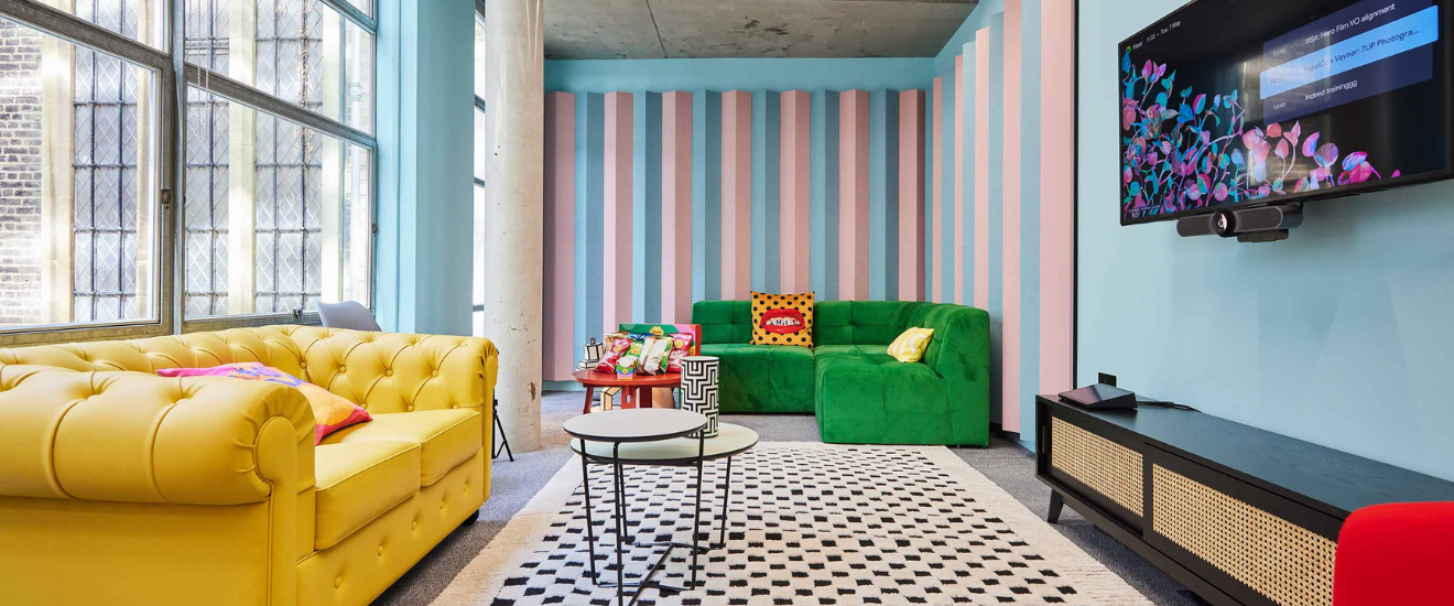
Your office environment plays a critical role in your overall productivity, creativity, and wellbeing. From the layout and lighting to the furniture and decor, every aspect of your office interior design can affect your mood and performance. Colour has the potential to make your work environment powerful and impactful on a user’s experience in the space. It has the ability to evoke different emotions, stimulate the senses, and influence behaviour.
In this article, we'll explore the power of colour and provide you with nine colour ideas to enhance your working environment. Whether you're looking to create a calming atmosphere, boost energy and motivation, or foster creativity, there's a colour solution for you. Let's dive in and discover how to harness the psychological effects of colour in your office design.
The psychology of colour
"Colours, like features, follow the changes of the emotions" ~ Pablo Picasso
Colour psychology explores how hues can affect human behaviour, influencing mood, energy levels, the senses and more. Colour can subconsciously communicate messages to our brains that we don’t always actively pick up on. Based on vividness, hue and other components, colour can affect the way we interpret the world around us.
Many studies have been conducted on human perceptions of colour, and the results have shown correlation in what some colours mean to us. Whilst some associations we make with colour can be translated across the globe, individuals may have an affinity for a particular hue based on unique experience – for example, a particular shade of red could remind someone of their childhood bedroom or of their mother’s favourite scarlet sweater.
The colours you choose for your workplace have the same power. A 2020 study, that surveyed over 4,500 people from 30 different countries, found that respondents made strong connection with the colour green and contentment, and that the colour yellow represented joy for many. So, the colours you choose for your workspace’s walls, furniture and decor have the ability to improve or impair your employees’ experience of their work environment.
9 colour ideas for your office
So how can you make the right colour choices for your team’s needs? Here are some ways that colour can affect us and how you can leverage colour during your office refurbishment.
1. Boost problem-solving and focus with blue
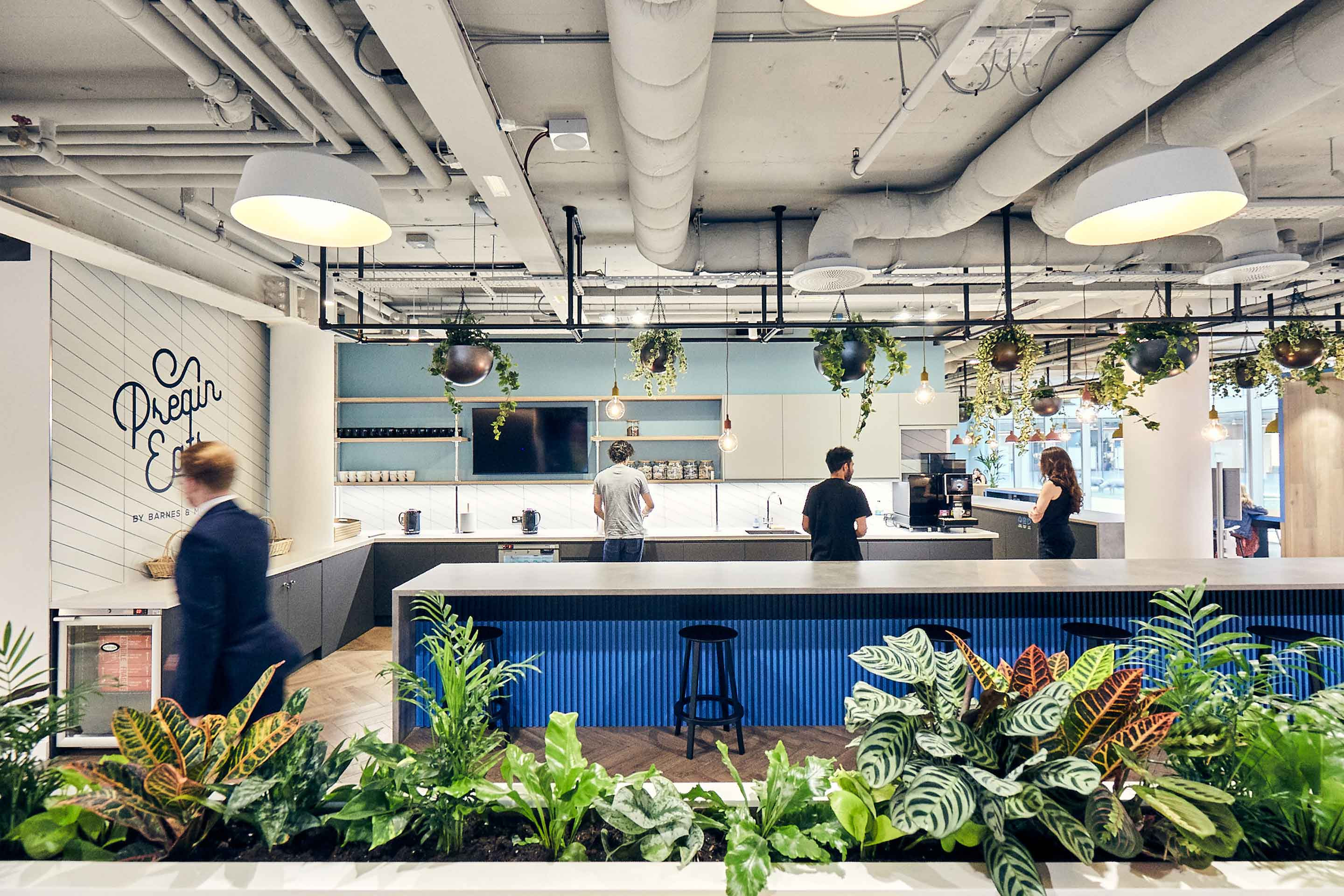
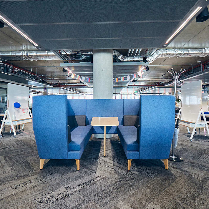
When thinking of the colour blue, many associate it with calm, peace and tranquillity. In the workplace, darker shades of blue have been said the help improve how we solve problems and make decisions, and lighter shades of blue can help us to focus.
With this in mind, using blue in focus and desk-working areas makes sense. Here are a few examples from our work with XTX Markets, Preqin and Mind.

2. Elevate optimism and resilience with green
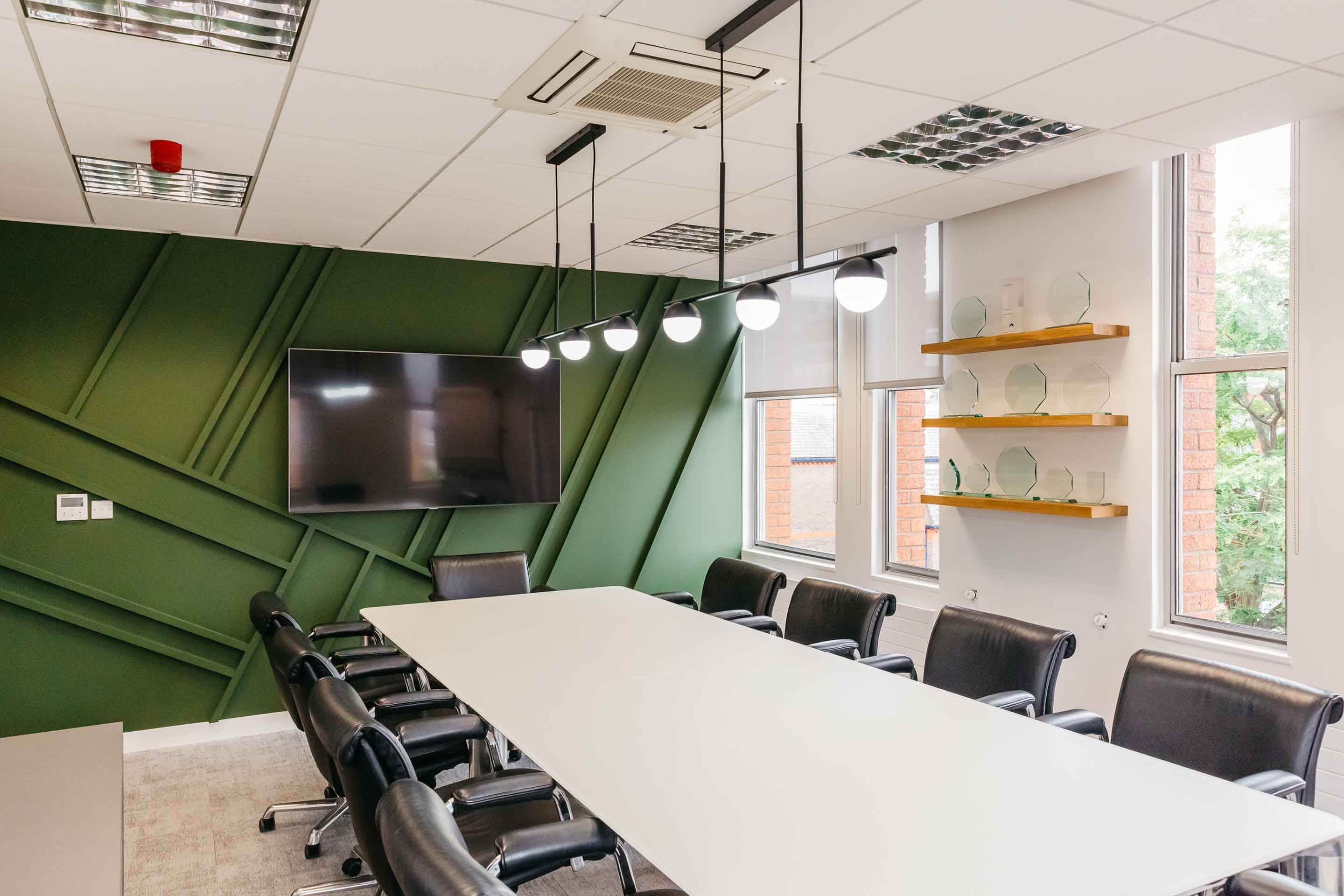
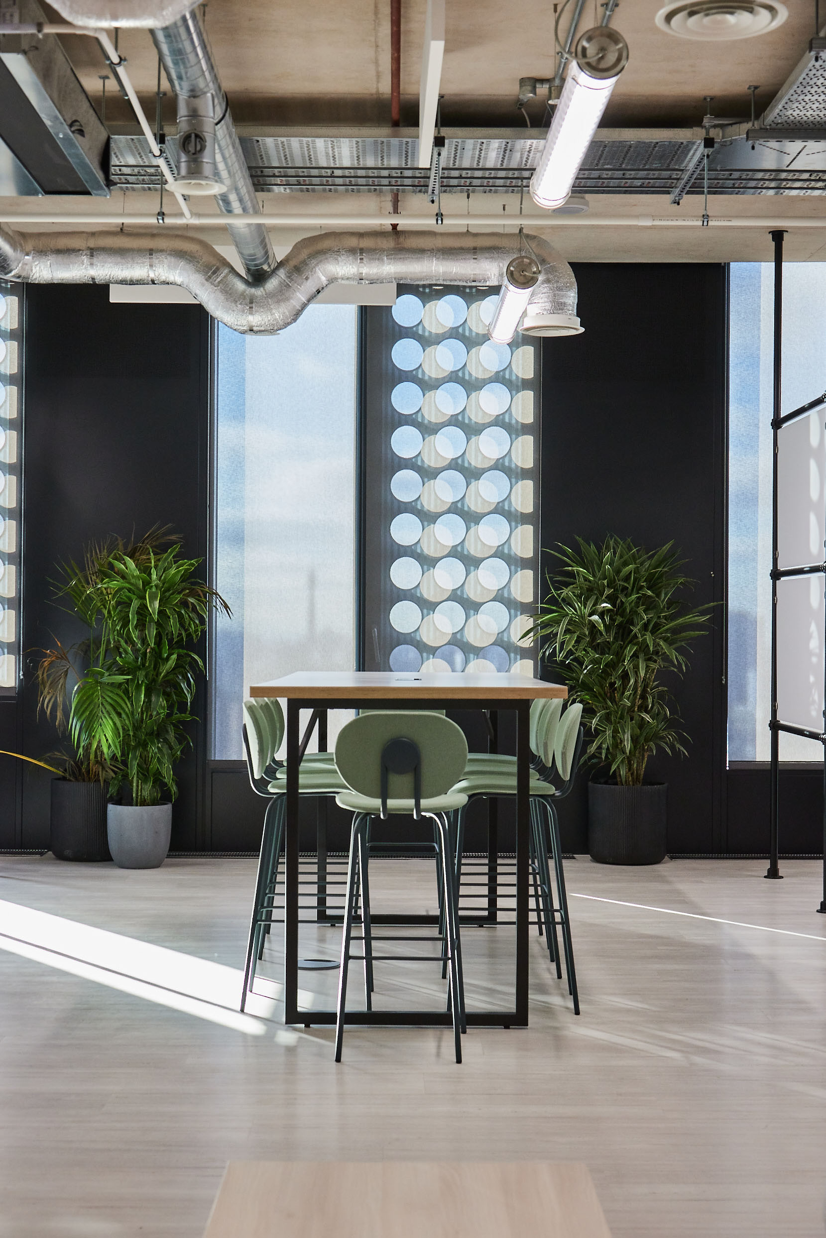
We often think of nature when we see the colour green. As a result, green is usually associated with abundance, harmony and peace. It’s also said to be the most relaxing colour for the human eye, so weaving this colour throughout the workplace could benefit the user’s wellbeing.
It’s also said to enhance stability and endurance. In the workplace, use green to promote happier, healthier mindsets and increase feelings of resilience among the team. You can implement it through paint or furniture like Carebase, through biophilia like Jacada Travel, or by subtly combining the two like Brainlabs.

3. Create calm and serenity with grey tones
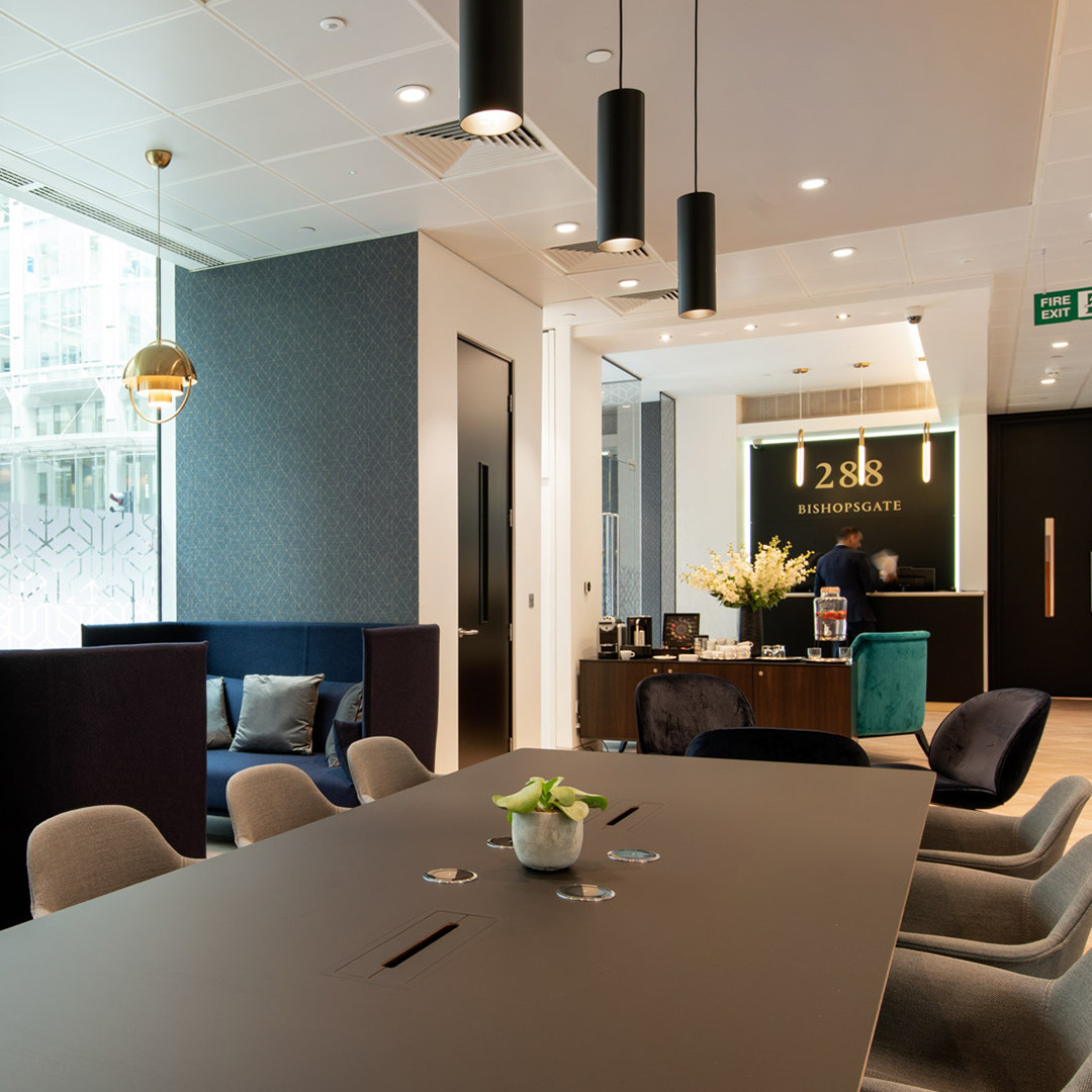
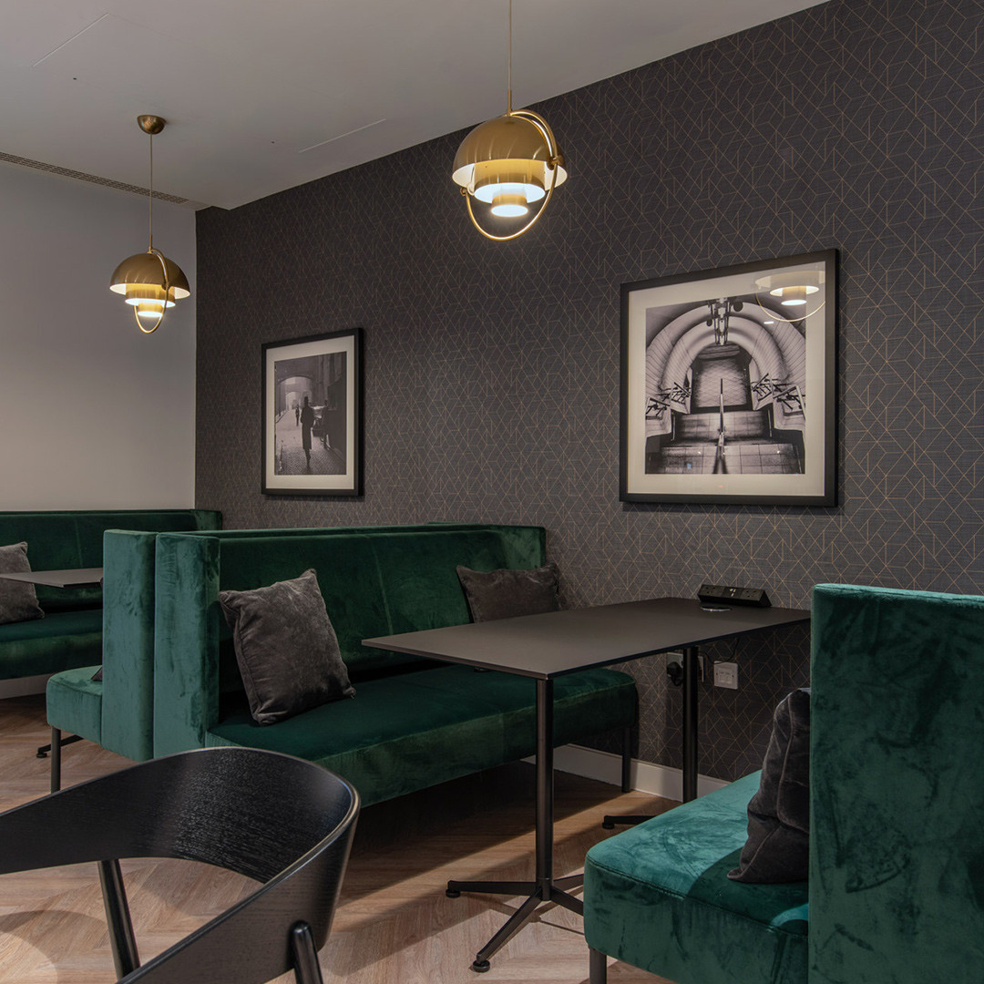
Grey can reduce emotional overwhelm and stress in general. It offers several benefits in the workplace, with its soothing and calming nature creating a serene atmosphere, helping employees unwind and find tranquillity amidst a busy work environment. Grey's neutrality also encourages a sense of balance and relaxation, fostering a more harmonious and stress-free atmosphere for increased productivity.
In interior design, grey can be used as a sleek statement or as a neutral backdrop for the overall look and feel of a space. Use lighter, warmer or more neutral hues for a more subtle approach, and incorporate varying shades of darker, blue-toned hues to position grey as the main focus of the design, with an understated but superlative feel. One workspace that demonstrates both in tandem is The Argyll Club in Bishopsgate.
4. Inspire confidence and belief with yellow
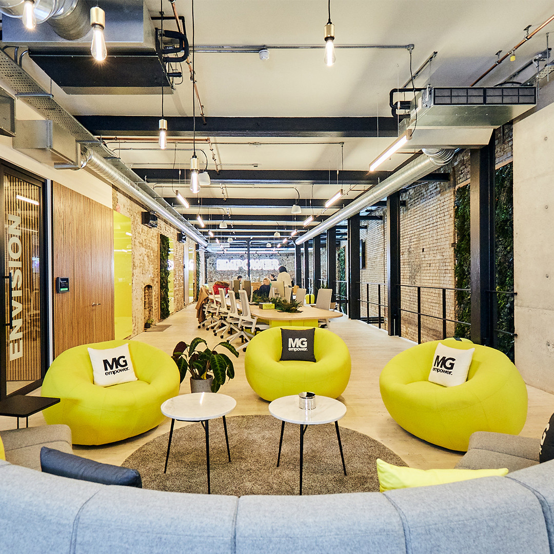
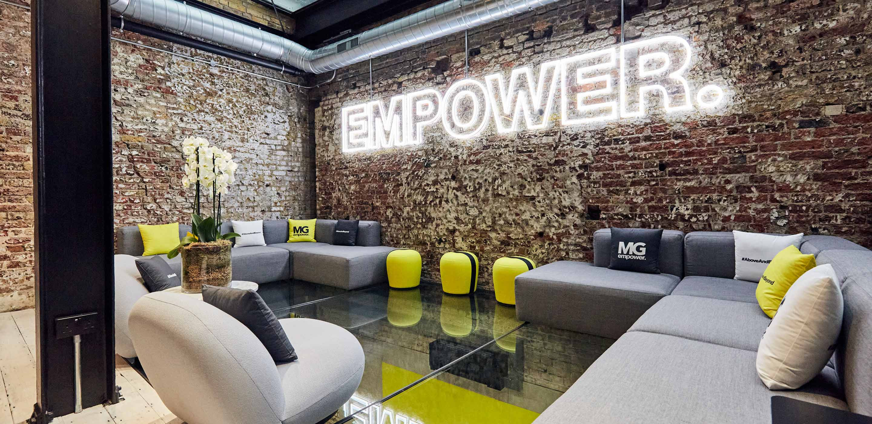
When we think of yellow, we may think of sunshine or sunflowers. Yellow is the colour of happiness, hope, belief and optimism. In a work setting, yellow has the potential to change mindsets to be more positive, provide energy and improve analytical thinking.
Use yellow to empower your team to work smarter, to have fun and to be bold. MG Empower’s new Clerkenwell HQ has plenty of yellow to keep its talented team in high spirits throughout the day.
5. Promote clarity and communication with white
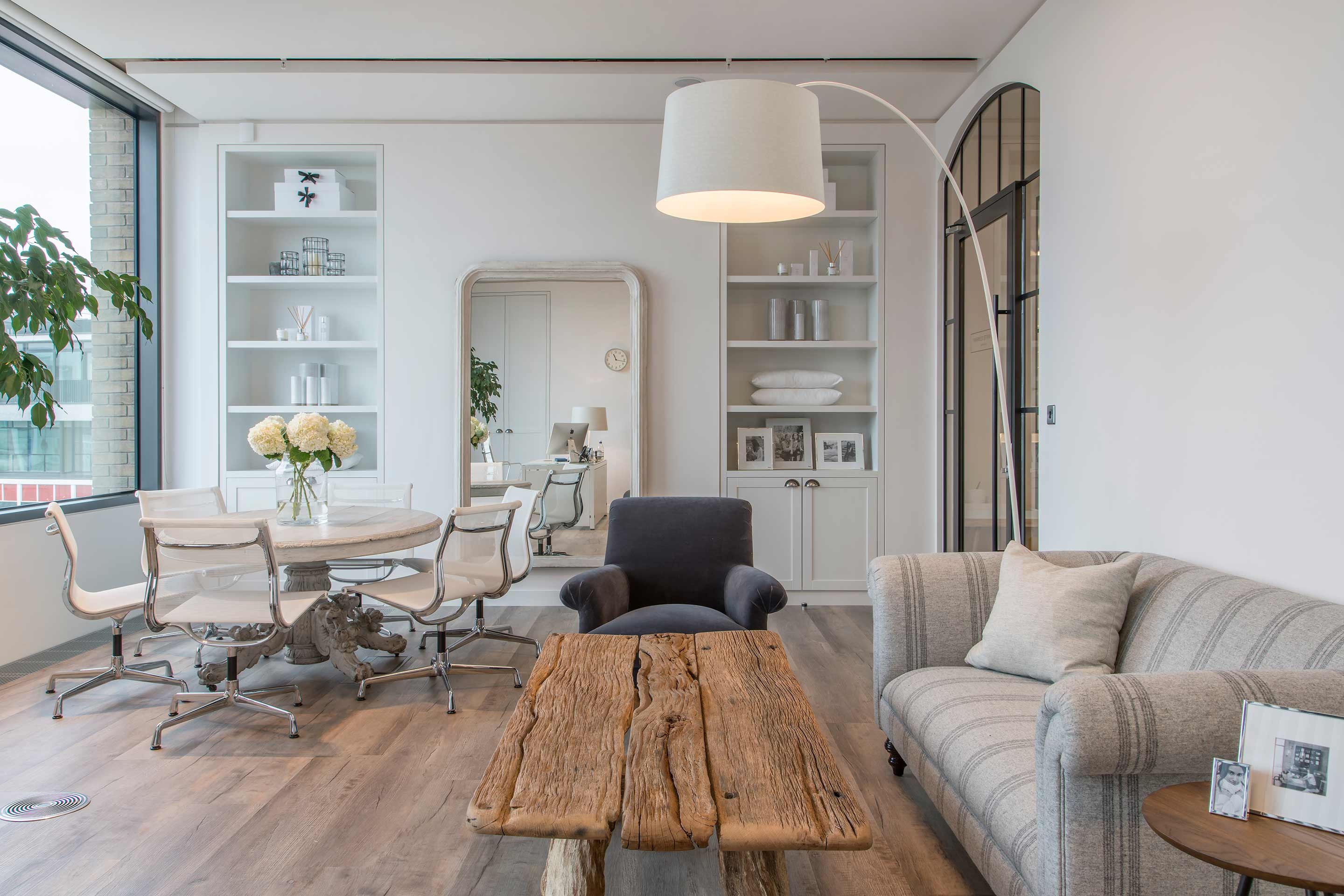
White has a lot to give to the workplace. White makes us feel at ease, refreshed and safe. In the workplace, white can help us to organise our thoughts, think clearly and communicate well. In design, white is used to make a space feel larger, airier and more relaxed. We embodied this feeling in our work for The White Company and DTZ Investors.
6. Give your space balance with neutral tones
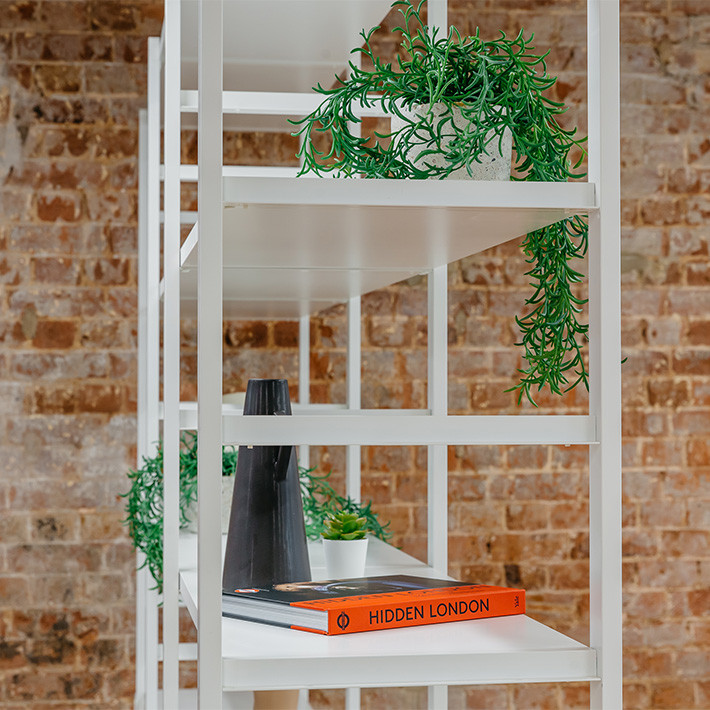
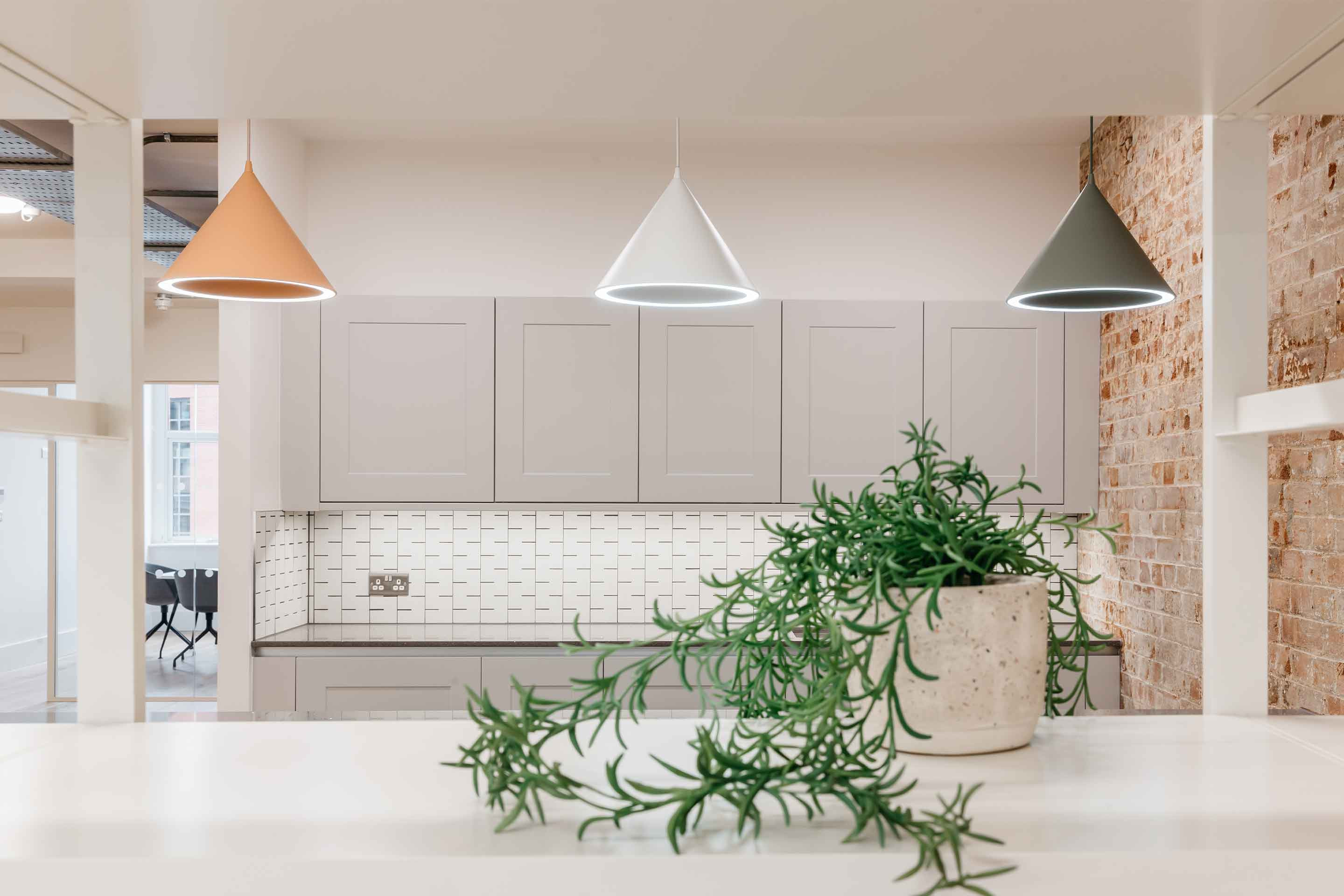
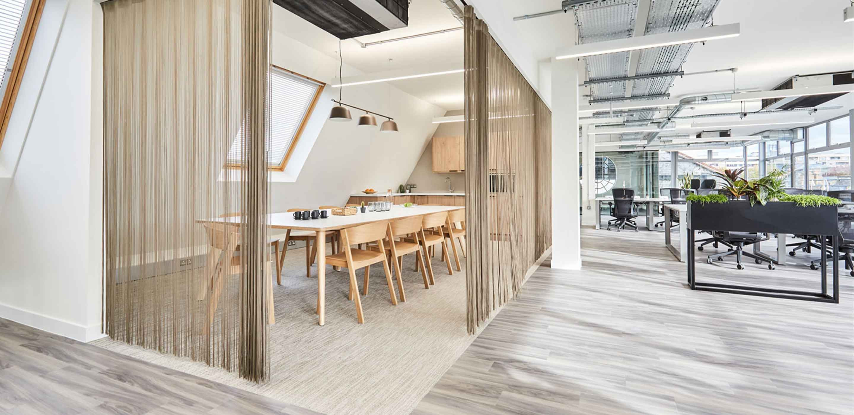
Neutral colours are easier for the eyes to process. Whilst bolder colours like red or blue may initially energise, over time they may exhaust or overwhelm. Neutral colours do quite the opposite; they blend into the background, helping us to feel restful and at ease. In design, neutral colours compliment others and help to highlight areas of focus by providing a blank canvas. You can use neutral colours to create a peaceful atmosphere or to accentuate a particular area, piece of furniture or decoration. We often use neutral tones in our work, including at Thirty Lighterman.
7. Invite warmth and energy with orange
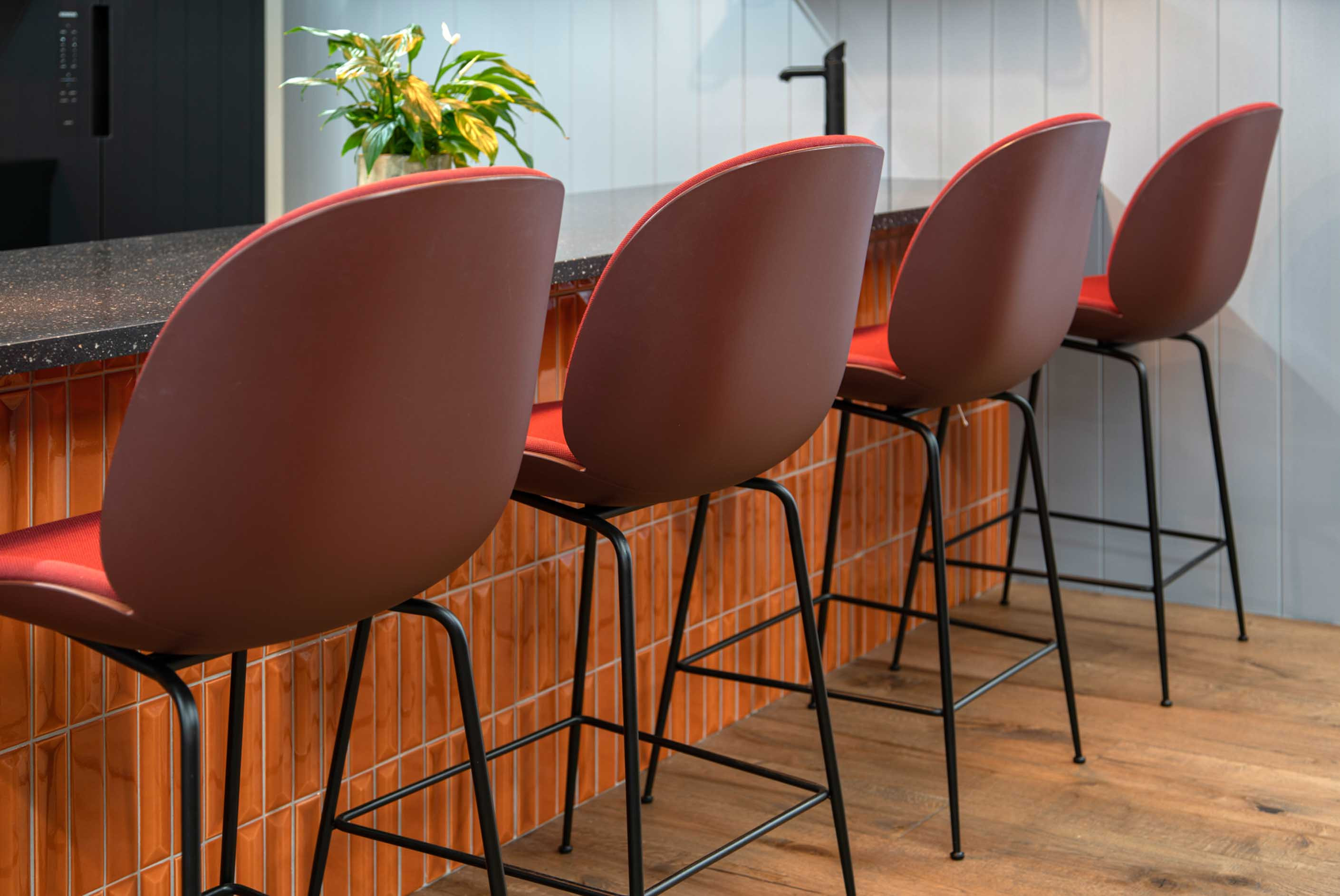
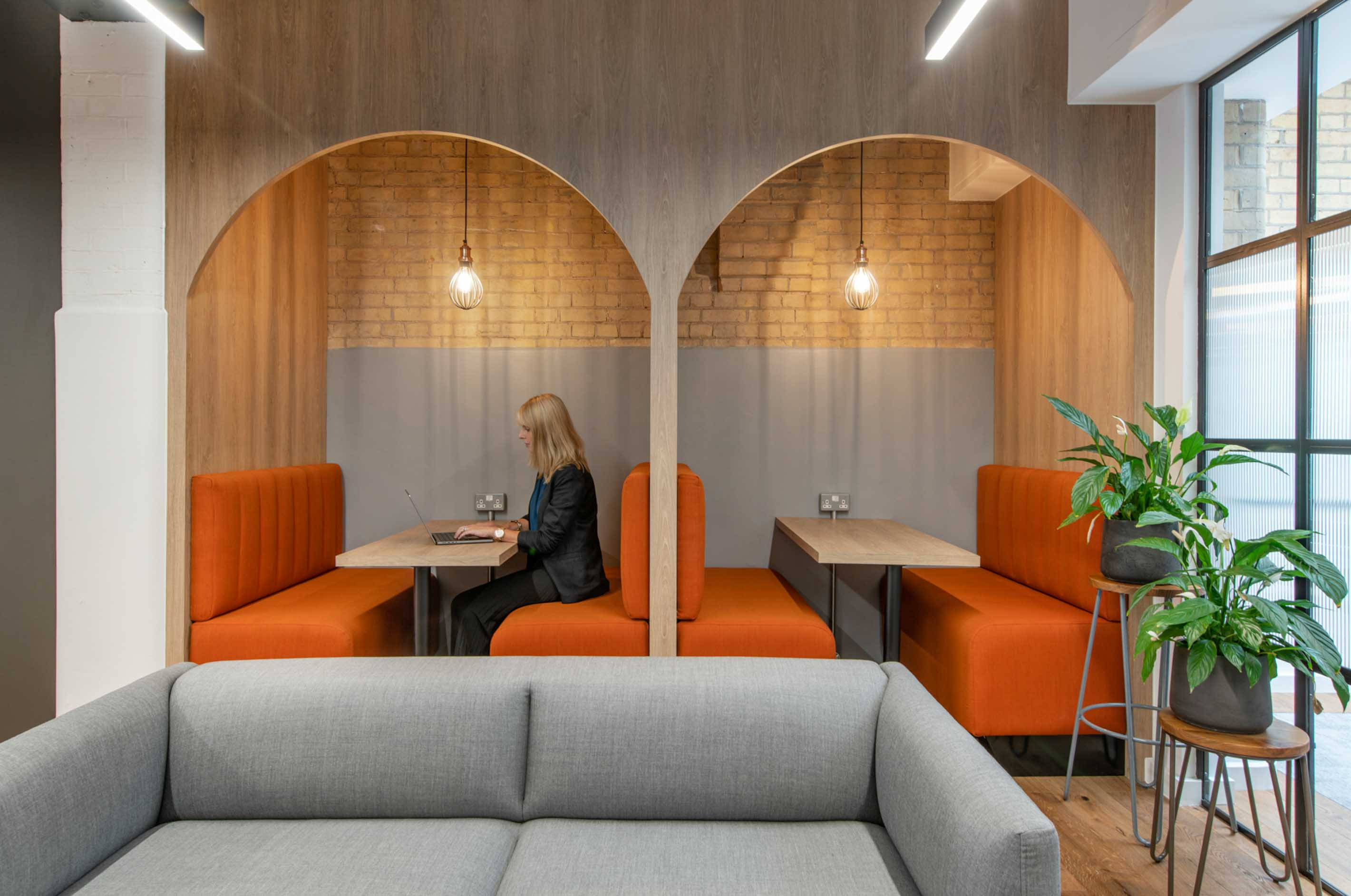
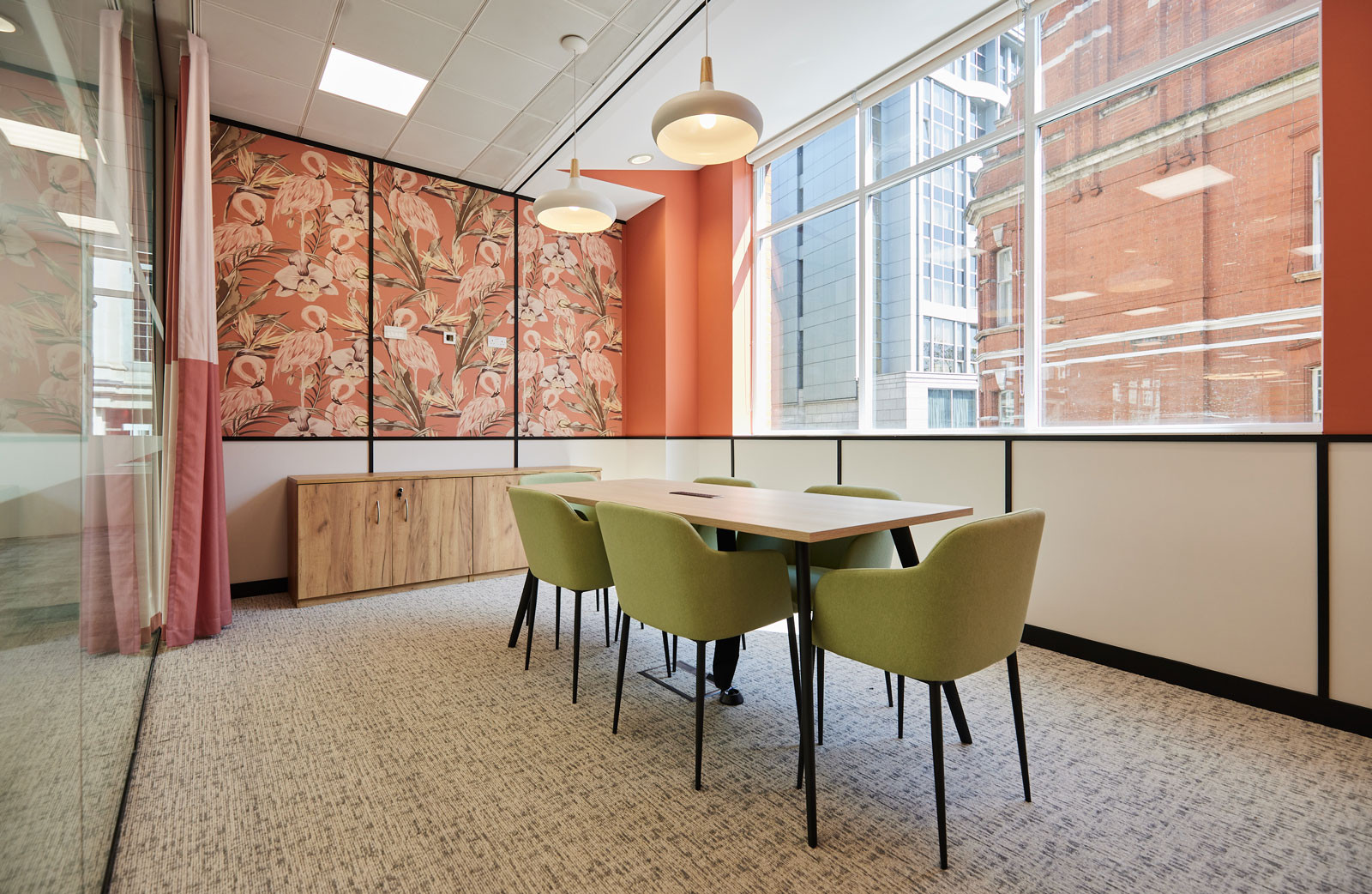
Orange is associated with energy, enthusiasm and happiness. As a bold colour, it commands attention. In the workplace, however, this colour should be implemented carefully. Bright colours can heighten energy levels, but in turn lower an individual’s ability to focus. As well, too much of a bold colour like orange can be overwhelming. It the workplace, use orange in spaces that you want to make a big impact, but be selective – a feature wall or statement piece of furniture is all you need to energise and excite the users of the space, without hindering the full experience. See how we created a warm, but energising space with orange for BBS Capital.
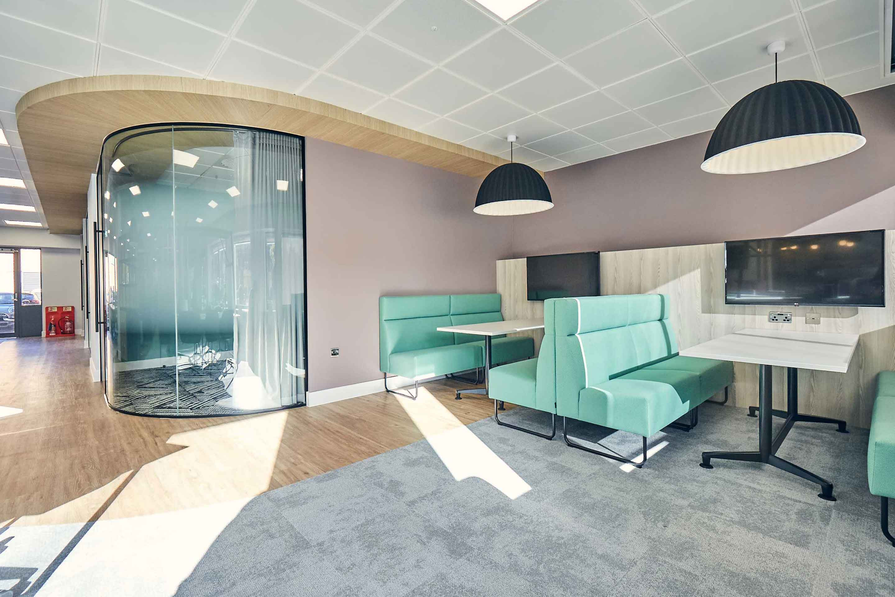
8. Foster harmony and happiness with pastels
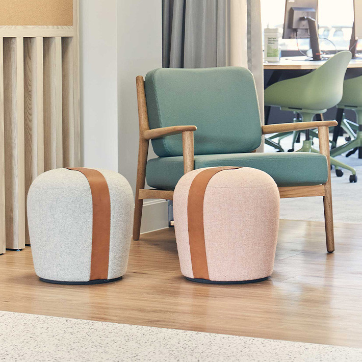
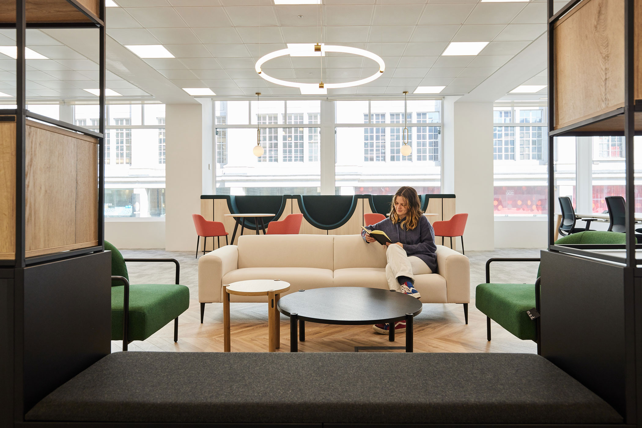
Pastels are incredibly powerful colours for positivity; this colour set can evoke feelings of playfulness, growth, springtime, childhood and more. Pastels can make us feel positive and balanced. This brings great benefits to the office environment and for business culture too. Increased positivity helps employees with problem-solving abilities, improves collaboration and general morale in the business and makes the office a nicer place to be. Use pastels in accent furniture, and in communal areas like touchdown areas and tea points, like we did for Grant Thornton.

9. Issue an invitation with vibrant colours
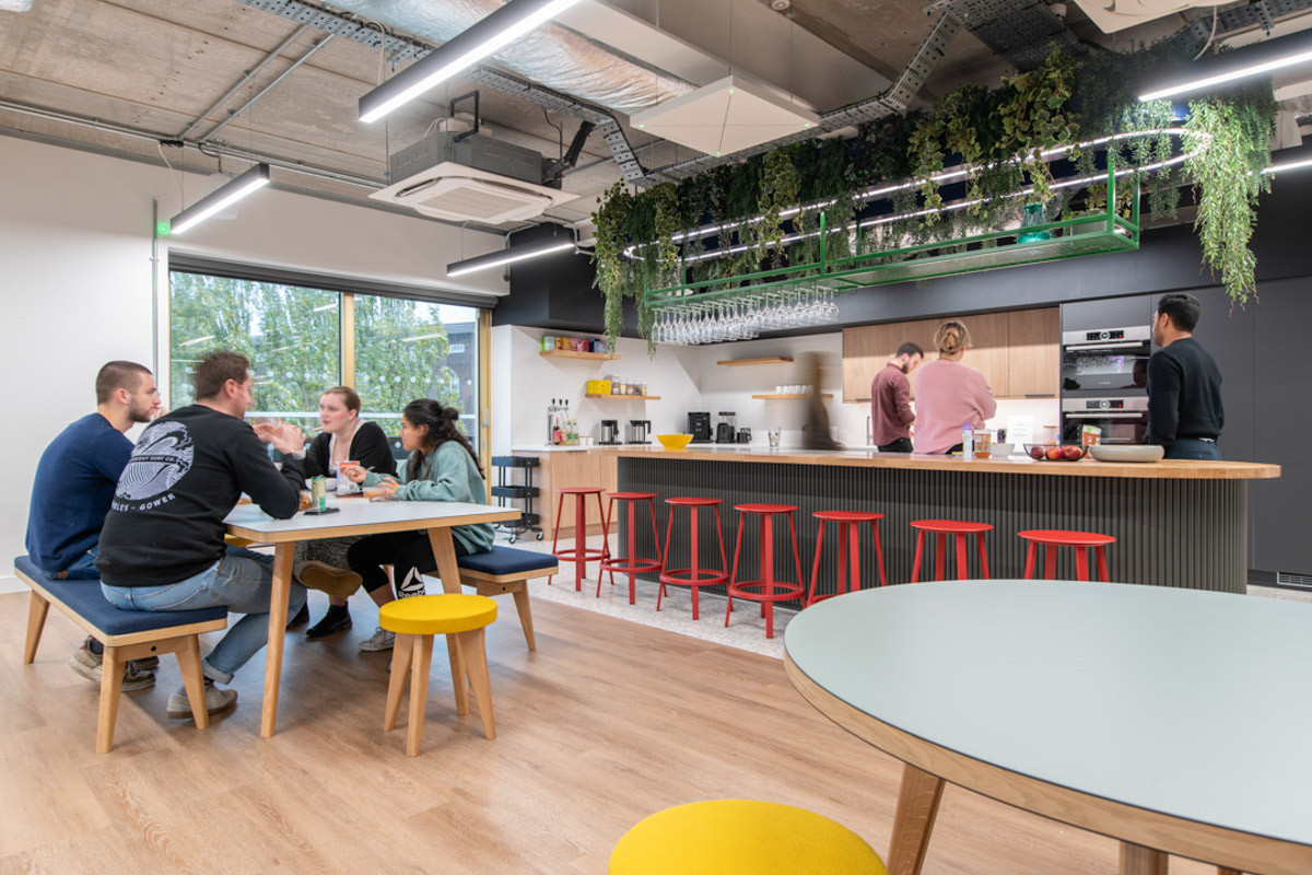
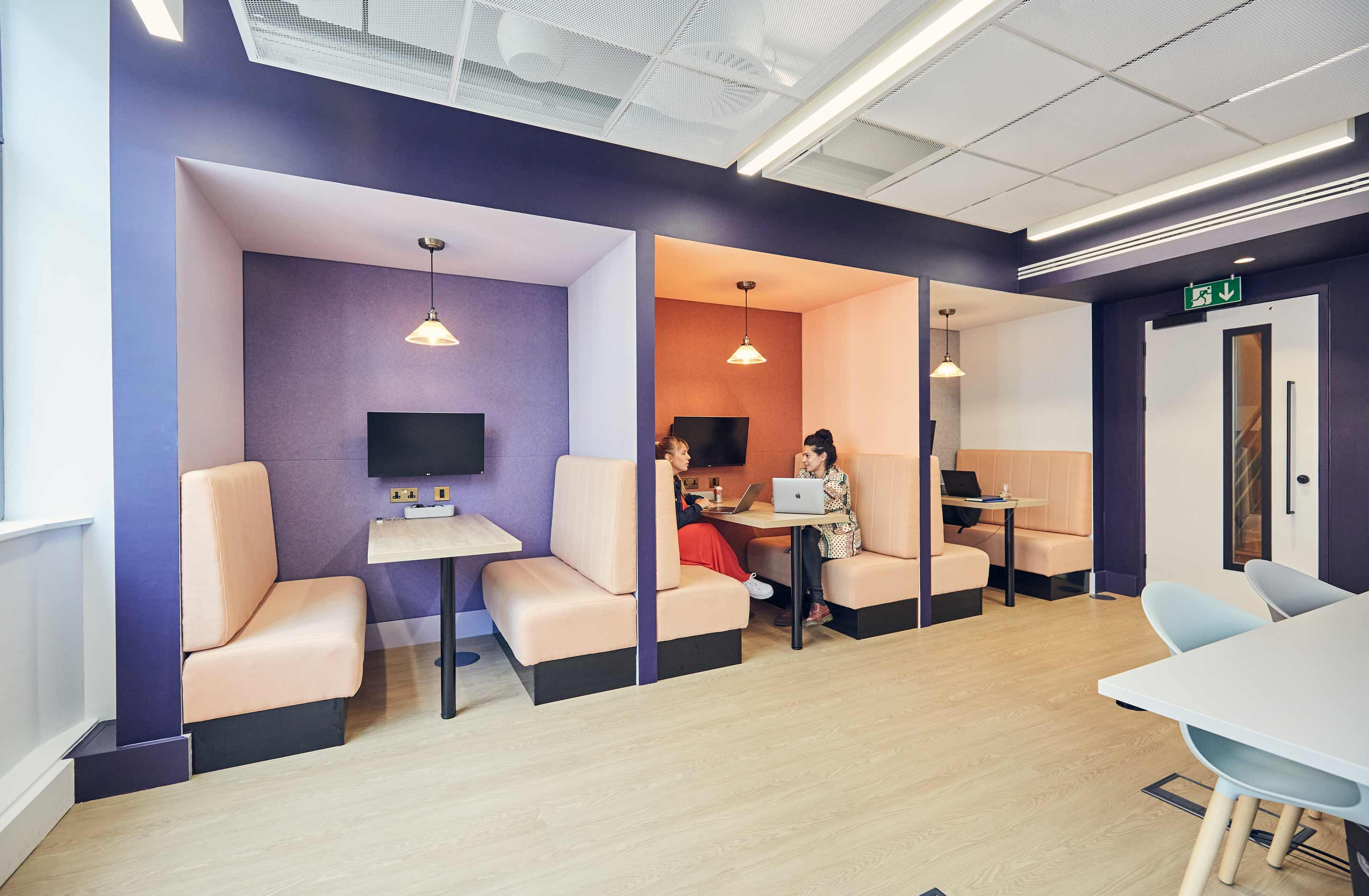
Bright colours can create a lasting and positive first impression on visitors to the workplace. They convey a sense of strength and creativity and provide a memorable experience from both clients and employees. These vibrant hues can evoke feelings of energy, excitement and warmth, enhancing the overall perception of the office and the business.
Vibrant colours don’t always have to be served in small doses – we flooded Brandpie and Beauhurst’s workspaces with bold, energising colour to uplift the mood, whilst maintaining an inviting atmosphere.
10. Just have fun with pink
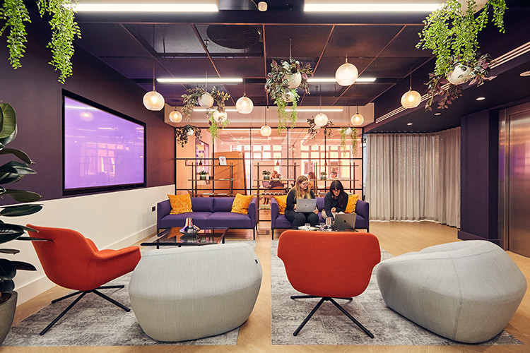
Pink is simultaneously a fun, romantic and calming colour. It’s also linked to kindness and affection, and has many cultural associations too, from Valentine’s Day to the visual identity for Breast Cancer Awareness Month. Softer pinks are considered peaceful, and brighter hues are bold and exciting.
Depending on what you want to achieve pink could be a unique addition to your workspace. For a maximalist effect, layer shades of pinks on top of one another with occasional patterns and textures. For a light and subtle approach, stick with light colours, smooth textures and clean lines.
We’ve worked with Just Group and Crestbridge to create pink-focussed spaces for their people, and we recently envisaged what the Barbie HQ could look like, which you can find on our LinkedIn and Instagram.

Just Group's office reflects their brand identity perfectly
Tips for applying colour to the workplace
If you’re not sure how to choose or combine colours for your space, here are a few tips to keep in mind:
- Consider subtly implementing your brand colours to embody your brand identity in the everyday
- Avoid pairing colours that are direct opposites on the colour wheel, like blue and orange or yellow and purple
- Pair warm hues together and cold hues together
- Implement colour via finishes like lampshades and cushions, so that you can experiment without too much commitment or investment
Take the first step towards transforming your workplace
We’ve learned that colour can affect how people perceive your business when visiting your workspace and how they feel when they’re working. It can make strong first impressions of your business to clients, and can help to embody what your brand stands for in physical form.
Whether you’re a workplace occupier or a commercial office landlord, if you’re starting your office transformation journey, speak to our team to discover your space’s potential.
You may also like

Creating spaces for everybody: The key to designing with neurodiversity in mind
Designing office spaces that cater to everyone is complex. Senior Project Designer Tash Hewlett explores...

5 office design essentials for a purposeful commercial office interior
Here are 5 office design essentials for a commercial office space. Get inspiration from our experts for a...

Start your workplace transformation today.
Your workplace holds enormous potential to improve your business performance. Get in touch today, and we will unlock that potential together.


